
Introduction
You might be going through this blog from your desktops, and many of you might be reading through your mobile phones. Our day is mostly spent on our mobile phones, scrolling through the feeds of our social lives feeding upon and seeking validation. According to the Smartphone Usage Statistics, people spend about an average of 3 hours and 15 minutes on their mobile phones per day. If any webpage or website is not optimally designed and adjusted to the mobile format, publishers will decrease their user experience, viewership, and ranking. Nowadays mobile page experience plays huge importance and is a deciding factor to get in the high ranks of search results. To provide a high-user interface experience to mobile users, the Product Management and designers’ team are leveraging the Mobile-First Design tactic/approach while creating a website.
Meaning
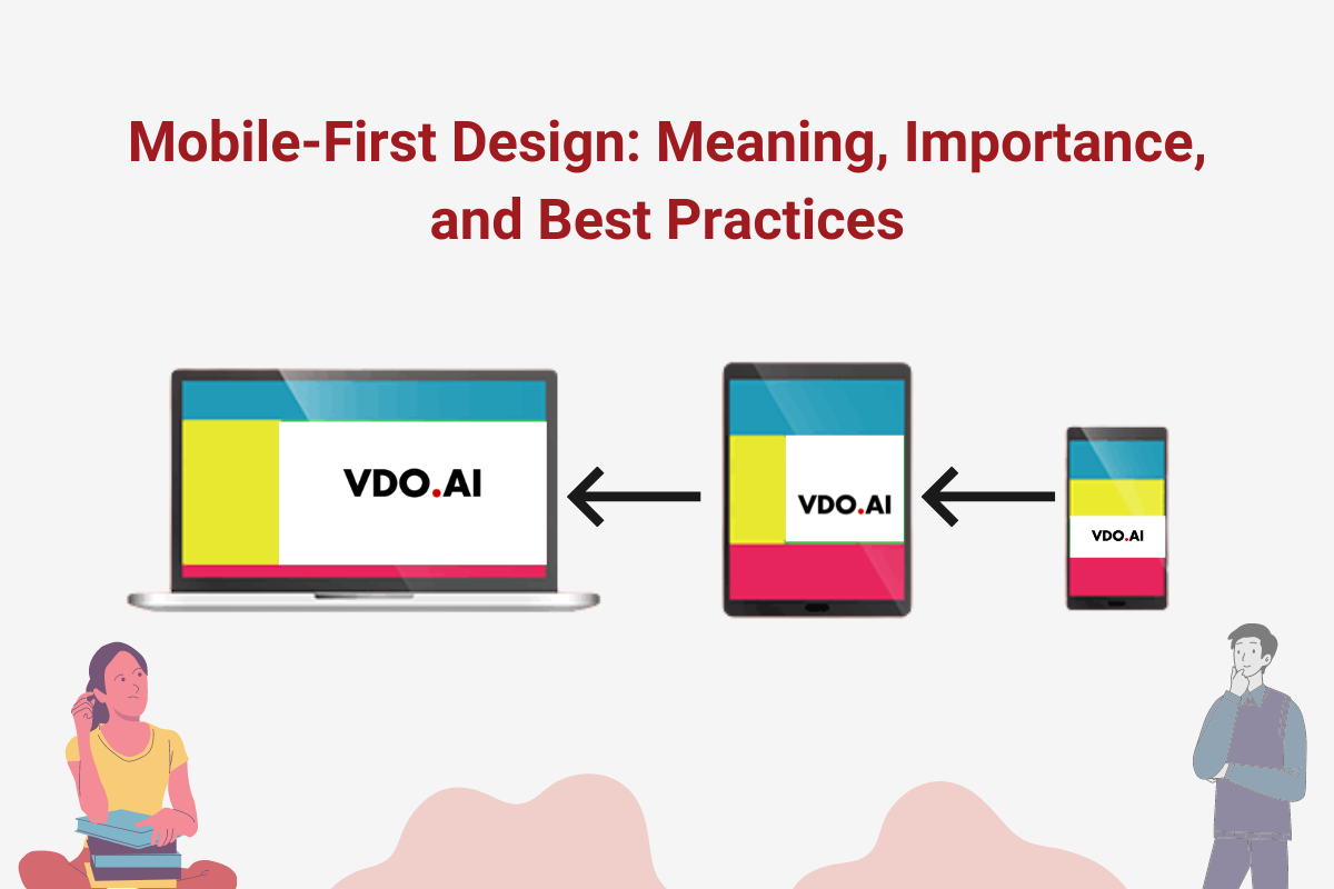
Let’s get back to the basics with the question “What is Mobile-First design?”. Mobile-first design is a design strategy in which a design prototype is made on smaller screens (mobiles) and then we are forwarded to larger screens (like Tabs and Laptops, etc.).
With that, you should also familiarise yourself with other design terms like Responsive Web Design aka RWD (a design method that enables the website to fit in the screens of different device Operandi which comfortably displays the content); the design approach like Graceful Degradation (an approach that starts with the product design from an advanced end like desktop and builds a version with well-rounded features at the beginning after which the product compatibility with mobile ends are done by cutting some functions or contents) and Progressive Advancements (an approach that designers use by building a version for the relatively lower browser with the most basic functions & features like that on a mobile phone and then moving to create advanced versions for a tablet or PC by adding interactions, more complicated effects, etc. on the basic version for a better user experience).
Our Mobile-first design follows the same rules as the Progressive advancement approach. The work starts with the product design from the mobile end which has more restrictions and then expanding its features to create a tablet or desktop desirable version. This is done so that if design work is started under restricting conditions, designers will seize the key points of a product and head for a lean & neat product with prioritized features. After advancing to the next platforms like PC or tablet, taking advantage of the unique features of these advanced ends to strengthen the product step by step is a brownie moment for designers to devour upon the moment.
Importance
The question popping in all of your minds must be: Why Mobile-First principle is so important in product design and also for publishers. Over the years, VDO.AI has observed that the Mobile-First Design strategy is taking the cake with its user experience over the others and is proving beneficial to both designers and publishers. Benefits like:
- Mobile internet usage has surpassed desktop usage since 2016 and is still counting. With that, Mobile-friendliness has now become an important metric system to measure page experience as Web vitals are about to advent in Google
- This strategy is minimizing the page latency with features and functions that are optimized for mobile browsers to reduce the load-time of the webpage.
- Publishers cannot go on without making a mobile compatible website because of this Jan 2021, around 3.8 billion people globally are smartphone users.
- Publishers and Designers can leverage the Cross-device target use for mobile web monetization with user-friendly mobile websites and pages.
- People have been spending more and more time on the mobile internet and with that, the exploding of mobile ends urges designers to pay attention to the mobile end specs and follow the “mobile-first” rule in product design.

Best Practices
To keep our Mobile-First design fruitful and desirable, the best practices publishers and designers can follow are:
- Keeping less and relevant content to avoid clutter in the website and to have concise and major details only for the mobile web end,
- Making the website simple as it can help in mobile web monetization with easily accessible and easy to navigate option with font adjustments and using ideal ad formats with assistance from VDO.AI that provides you best video ads and with less disturbance on the website.
- Creative additions and practices like these can help to roll out the monetization for the websites for the publishers, especially at the mobile end.

Conclusion
The “mobile-first” principle has an important role in product design. It helps to save product design time, improves designers’ productivity, and also forces the designers to think out of the box and pay more attention to the content of a product helping them to create neat and practical designs.
To know how can you integrate the best engaging user experience by your Mobile-first design, connect with us here at VDO.AI.
Be a part of our extended family and receive product updates, company news and other promotional updates by clicking Subscribe.


